My little woodworking business involves both custom furniture, and the production of smaller items, such as cutting boards, coasters, wine displays, bookmarks, etc., which I sell at retail locations, primarily a wonderful place here in DC, called Shop Made in DC.
This may sound obvious, but for these smaller items, it is helpful, especially for a store, to have “products” which I’ll define as things that are repeatable/predictable (unlike a custom piece of furniture, or a one-off cutting board). Products are a different kind of challenge from building a custom piece, because the design has to be appealing to many people (if you’re going to sell them) and you have to develop processes to do them quickly (more on that in another post).
I have a series of posts that will talk about the ways in which various products have been “designed.” Quotes here because much of it has been unintentional/lucky/assisted by others.
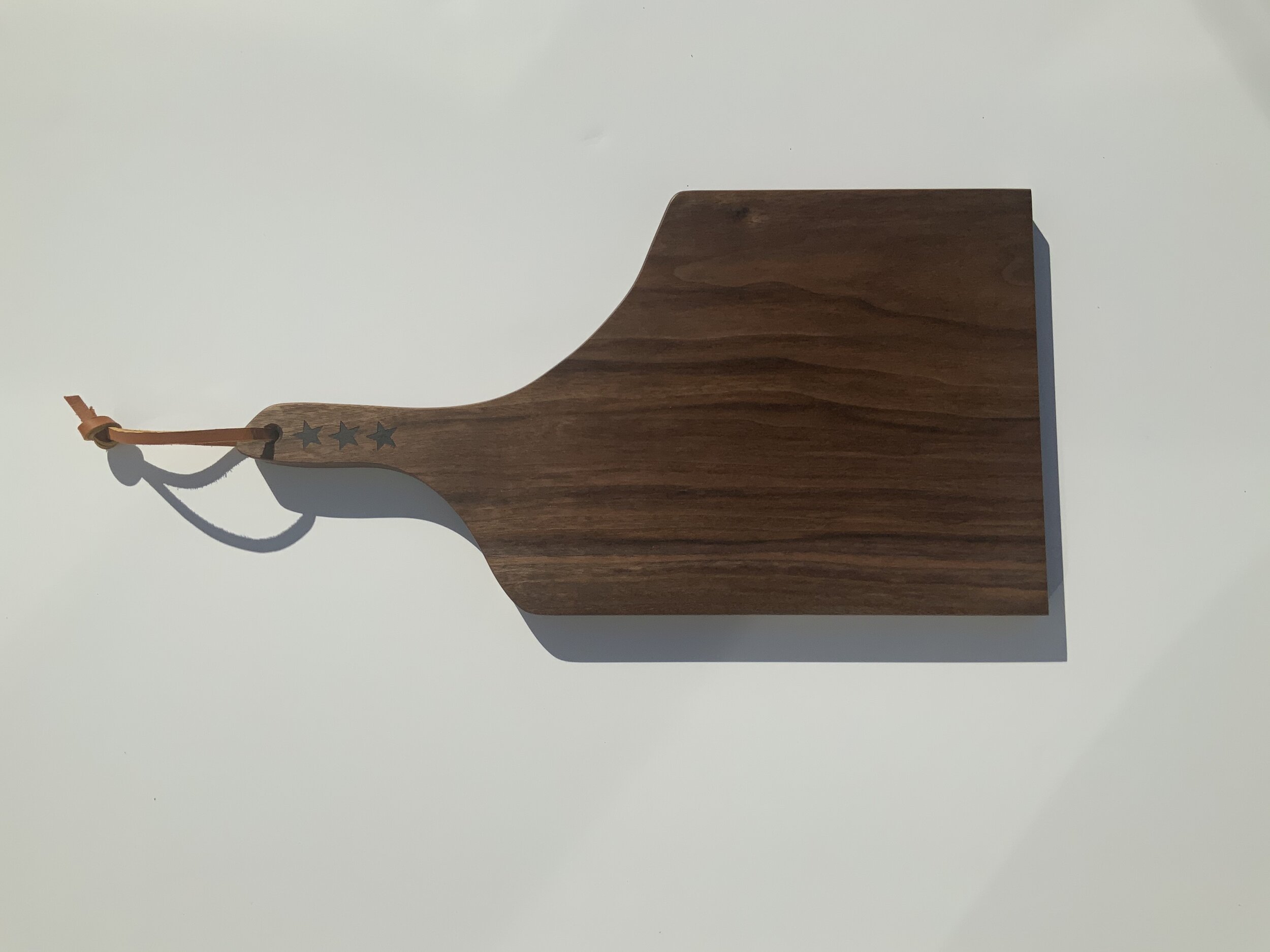
The first in this series, is a cutting board shaped like the District of Columbia.. This is an example of a design being repurposed, cleverly named, and then dressed up. Here’s how it happened.
My wife’s Uncle Bill found a cutting board he liked. Like the DC board, it had shoulders that were not parallel. He also liked the grain pattern in that specific board. He asked me to make him one like it, so I did. Because I’ve learned that if one person likes something enough to buy/order/customize it, other people will too, I made a small batch of the “Uncle Bill” boards. I’ll note here that I worked only from a picture, figured out the relative dimensions in the shop (based on what I thought looked good) and made the design my own. Bill seemed pleased with the results…he’s a nice guy AND a straight shooter, so I’m pretty sure if I missed the mark, he would have let me know, gently).
What’s Uncle Bill got to do with DC?
Right, so a few months later, around the holidays, my friends Mark and Jenn came by to pick up some cutting boards for holiday gifts. Jenn picked up the Uncle Bill board and said, “Oh, this is DC!” I hadn’t seen it before, but I saw it immediately after she said it. She also used the word “stylized” which I quickly adopted for the product description. Thanks, Jenn!
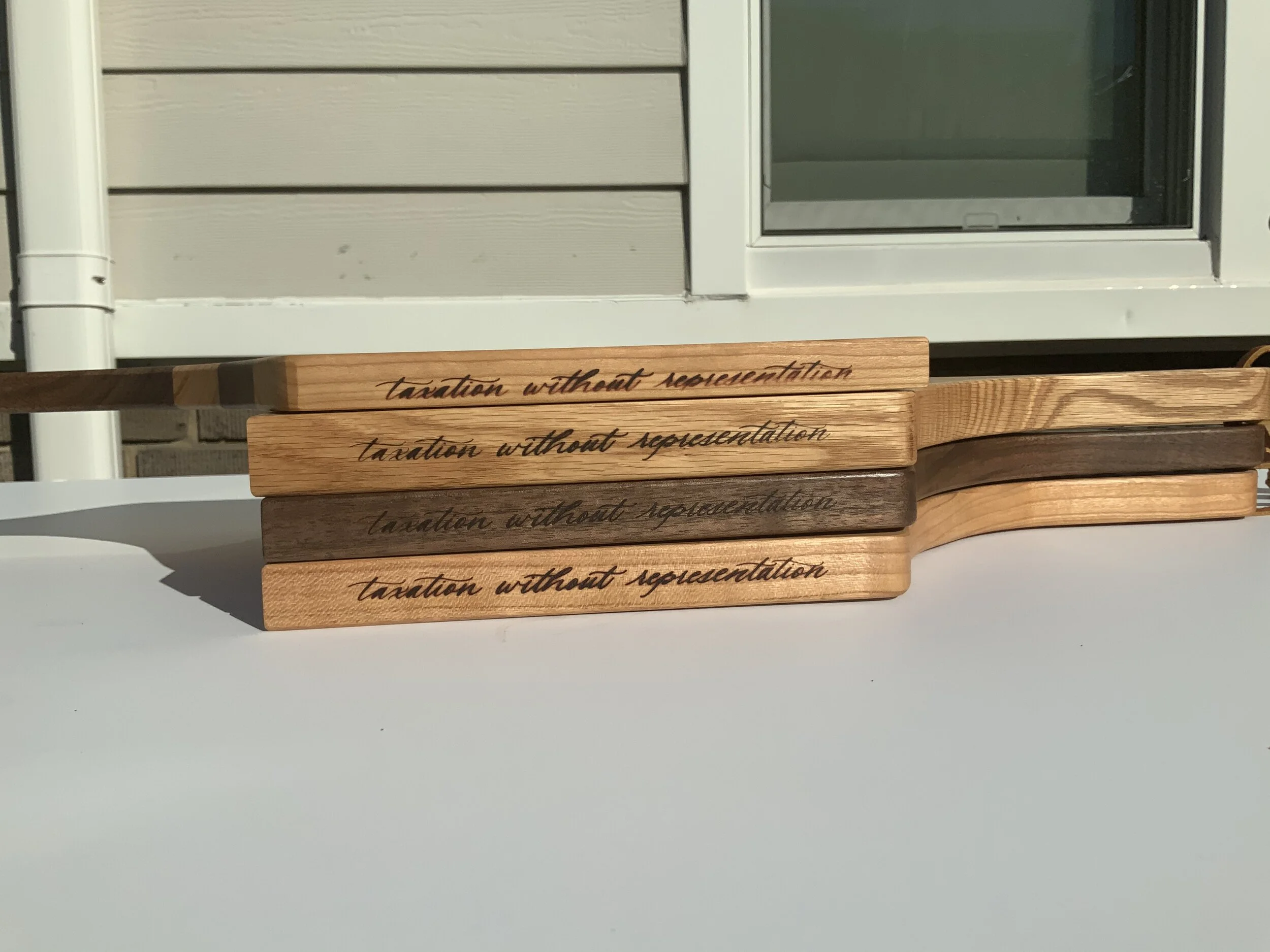
While she was right that I had inadvertently imposed the “stylized” DC shape onto Bill’s board, I thought to really make it work, I had to give the board some flair—to make it clear to the uninitiated, what was happening here. So, I added three stars to the handle (our flag has 3 stars…it’s kind of a thing here) and our motto “taxation without representation” to the edge. (No words are missing. We pay federal taxes and don’t have a voting representative in Congress)
I also made this version, which puts the flag right onto the board:
Initially, I used my own hand script and a wood burning pen to write the phrase down the side. I quickly tired of this...my script is not my strong suit and it took far too long. About the same time, I had realized the value of branding irons. I called Bill’s daughter Sam who has her own business doing hand lettering and paid her for a vector image of beautiful script, made it into an iron, and voila. Product, designed. The whole process unfolded over about a year...stay tuned for an update on this.


